Зміст
The color of an ottoman doesn’t just determine how an object looks in a photo. It changes the temperature of a space. It makes a room feel warmer or cooler, softer or more graphic, calm or bold. The same silhouette can appear as a neutral soft accent, a deep dramatic spot, or a subtle color gesture—it all depends on the shade, the fabric, the light, and the environment.
That is why it is better to create one strong hub article at the start about colored poufs, and not 15 separate materials for each color at once. It is important for the user not to just find a “gray pouf” or a “red pouf”. He needs to understand which color will work in his interior: next to the sofa, against the wall, next to a wooden floor, in a beauty salon, showroom, hallway or lounge area.
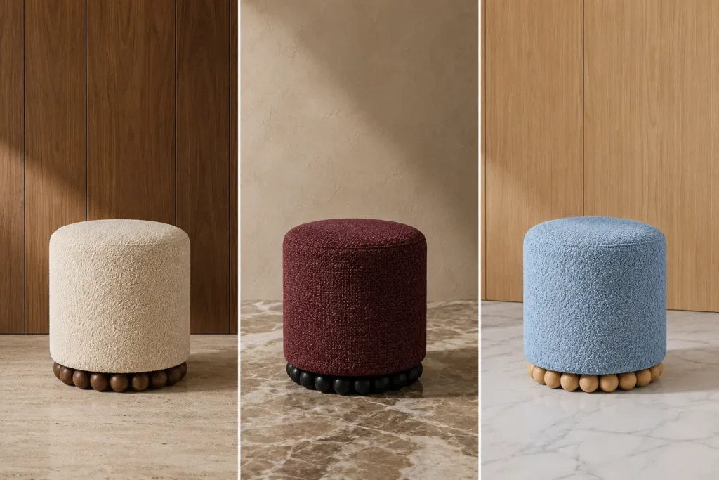
This is clearly visible in the images. The shape is the same: a round soft pouf on a spherical base. But the milky, burgundy, blue, beige, terracotta and brown options are perceived completely differently. Color here is not a decor. It is a tool for setting up space.
Why the color of a pouf is more important than it seems
A pouf is a small object. But that’s exactly why the color on it works very concentrated. A sofa in a bright color can seem risky. A wall in a rich shade changes the entire room. And a pouf allows you to add color pointwise: without renovation, without completely replacing furniture, without overloading the interior.
Formula:
POUF COLOR = TEMPERATURE + ACCENT + CONNECTION WITH THE INTERIOR
Temperature is a feeling: warmer, cooler, softer, deeper.
Accent is the ability to attract the eye.
Connection is how the pouf works with the sofa, walls, floor, curtains, lighting, mirror, or brand colors.
In the article about designer poufs We have already understood that design is not an empty epithet, but a form, fabric, proportion, print, color and scenario. In colored poufs, this logic is especially noticeable: only the shade changes, and the feeling of the object becomes completely different.
Gray pouf: calm, graphics and versatility
Gray pouf — one of the safest options for a modern interior. It doesn’t clash with a sofa, and works easily with white, beige, black, wood, and concrete surfaces. But gray doesn’t necessarily mean boring.
A light gray pouf adds calm and does not distract attention. Graphite – makes the space clearer. Gray with textured fabric looks deeper than a smooth monochromatic surface. In the living room, it can support a carpet, curtains, stone or metal details.
Gray works well if:
- the sofa already has an active color;
- there is a lot of wood in the room;
- a calm additional element is needed;
- the space is decorated in minimalism;
- The pouf should not be the main accent, but a link between objects.
For a lounge area, a gray pouf can be a soft neutral element next to the sofa. More details about this scenario can be found in the article “Pouf by the sofa”.
White pouf: purity, light and softness
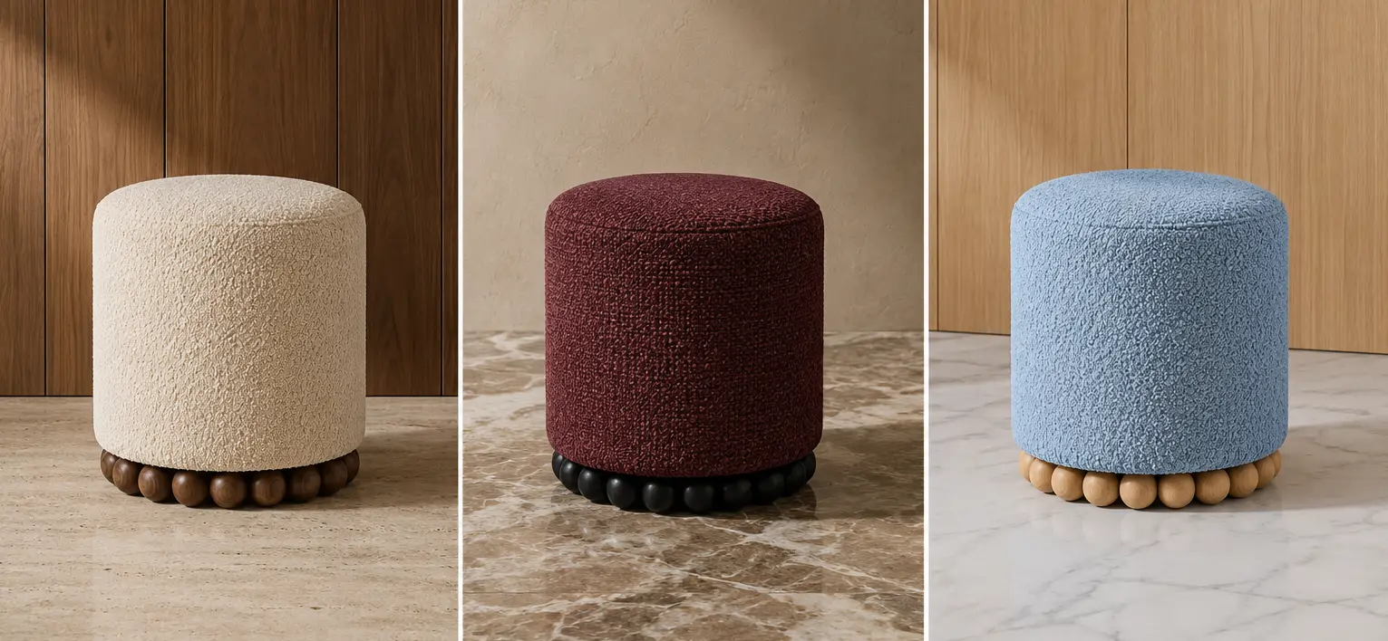
White pouf or a milky pouf works not as a bright spot, but as an amplifier of light. It makes the space airier, softer and visually lighter. In the first image, a milky textured pouf stands against a background of dark wood, and it is the contrast with the wood that makes it so expressive.
A white pouf works especially well:
- in the bedroom;
- near the dressing table;
- on the balcony;
- in a bright living room;
- in a beauty salon with a soft palette;
- next to wood, marble, beige walls.
But white needs the right fabric. Texture is critical. A plain white can look too sterile, while a boucle, chenille, or matting add volume and texture.
A white pouf is not about “invisibility.” It’s about silence. It can be very expressive if it’s placed against the right background.
Beige pouf: a warm neutral for living spaces
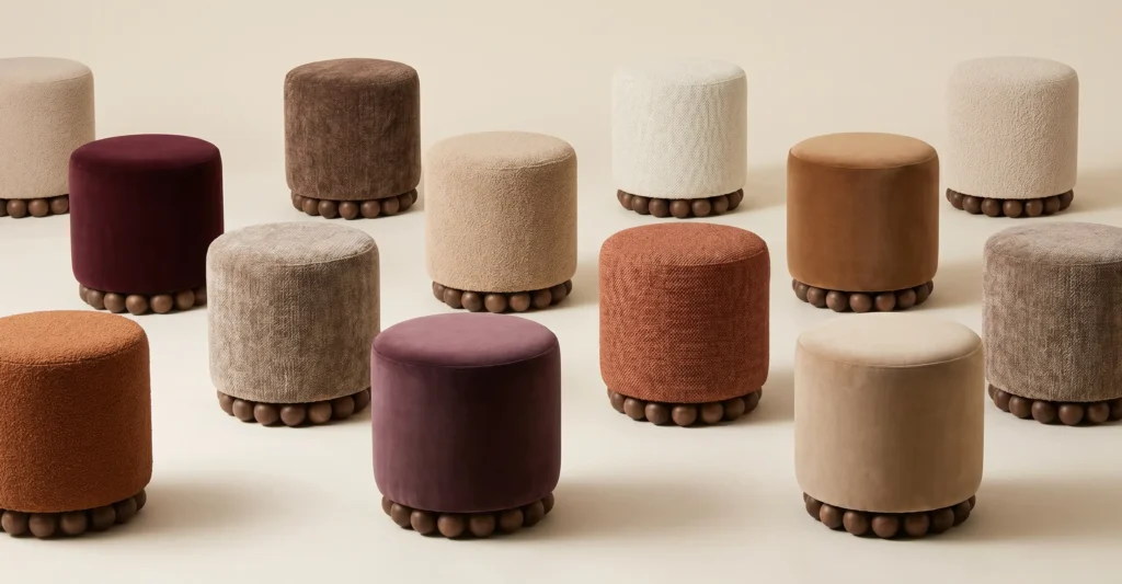
A beige pouf is one of the most versatile options for your home. It’s softer than white, warmer than gray, and more calming than brown. The second image shows several beige and cream options: they don’t compete for attention, but create the feeling of a soft, expensive, collected space.
Beige works well with:
- wooden floor;
- warm walls;
- milk sofas;
- linen curtains;
- natural carpets;
- brass lamps;
- stone and marble.
A beige pouf is appropriate when the interior needs softness without a sharp accent. It fits well in the bedroom, hallway, compact area near the window or beauty zone. You can read about compact scenarios in the article “Small pouf for balcony, kitchen and compact areas”.
Black pouf: graphics, contrast and clarity
Black pouf — it’s not just a “dark object.” It’s a way to add graphics to an interior. It works well in light spaces that lack contrast, or in interiors with black details: mirror frames, lamps, furniture legs, door hardware, accent textiles.
A black pouf can be:
- completely black;
- black with texture;
- black on a light background;
- light with black art print;
- with black ball legs.
In the first image, the burgundy pouf has a black base. This immediately makes the object more graphic and collected. This technique can be used for a light-colored pouf as well: black legs or a dark base add contour.
A black pouf works well in showrooms, salons, living rooms and lounge areas where a clear visual point is needed. But in small rooms it is better to balance it with a light carpet, walls or wood.
Red pouf: energy and a bold accent
Red pouf — is a strong decision. It immediately becomes noticeable and rarely remains a background. Red adds energy, movement, emotions. In the living room, it can support a painting, pillows, a carpet or an art object. In a salon or showroom — become part of the brand palette.
But red needs to be controlled. If the space is already saturated with details, it is better to choose not a pure bright red, but a deeper wine, burgundy or terracotta shade. This way the accent will be strong, but not aggressive.
A red pouf is appropriate if:
- the interior is too neutral;
- an emotional point is needed;
- the brand has red in its palette;
- the sofa or armchair is calm;
- next to it is a warm wood or milky background.
One red pouf can replace several small decorative accents. But it must be accurate in fabric and location.
Burgundy pouf: depth, warmth and adult drama
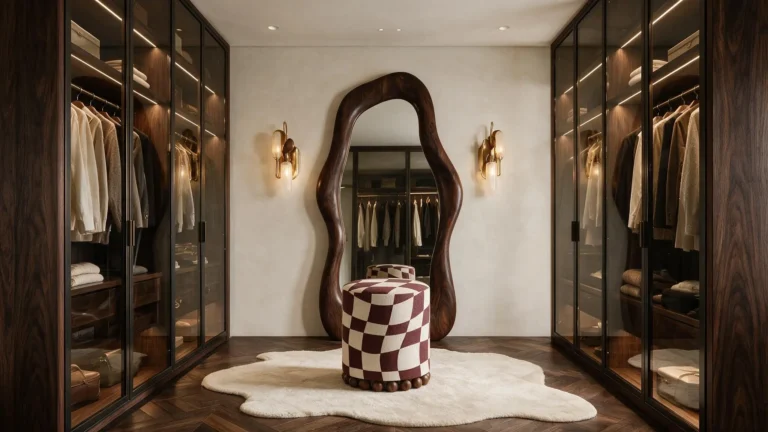
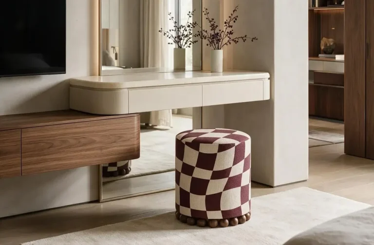
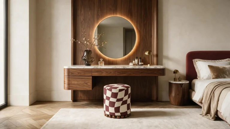
A burgundy pouf is a softer and more sophisticated alternative to red. It is not as loud, but has depth. In the images, burgundy is used in two versions: as a plain textured pouf and as a burgundy and milky checkered motif. Both solutions work warmly, expressively and quite premium.
Burgundy goes well with:
- dark wood;
- milky walls;
- marble;
- brass;
- cream textiles;
- brown and caramel shades;
- black details.
In a private interior, a burgundy pouf can stand next to a bed, sofa, or dressing table. In a beauty salon, it creates a more intimate, recognizable mood. In a showroom, it adds depth without being too bright.
This is a good color for those who want an accent but don’t want a direct “redder” energy.
Green pouf: naturalness and balance
A green pouf adds a natural feel to a space. It can be olive, sage, emerald, dark green or a soft gray-green. Each option gives a different feel.
Light green works calmly and naturally. Olive is warmer and more complex. Emerald is more luxurious. Dark green is intimate and deep.
The green pouf looks good:
- near plants;
- against the background of a tree;
- in beige interiors;
- next to the milk sofa;
- in salons with a natural concept;
- in showrooms where you need to add a lively accent.
If the space already has a lot of warm wood surfaces, green can provide balance. If the interior is cold, it is better to choose warmer shades of green rather than a harsh pure green.
Blue pouf: coolness, freshness and visual lightness
A blue pouf can change the temperature of an interior towards coolness. In the first image, a light blue textured pouf stands against a background of light wood and white marble. It looks fresh, light and a little unexpected.
Blue works well where you need to refresh a warm interior: a wooden kitchen-living room, a beige bedroom, a balcony or a bright showroom. Dark blue creates a deeper, almost hotel-like mood. Light blue is lighter and airier.
You should choose a blue pouf if:
- there is a lot of warm wood in the room;
- need a cool accent;
- the space is decorated in a light palette;
- the brand has blue in its identity;
- I want color without excessive emotionality.
Blue is rarely random. It is better to support it with at least one detail: a painting, a vase, a textile, a poster or a decorative element.
Yellow pouf: light and optimism
A yellow pouf is about light. It can make an interior warmer, even if the room doesn’t get much sun. But yellow requires careful tone selection. A pure bright yellow looks bold, almost pop art. Mustard is warmer and deeper. Sand is calmer. Honey is softer.
A yellow pouf works well:
- in children’s or creative spaces;
- in salons with a warm identity;
- on the balcony;
- in the lounge area;
- next to a gray or beige sofa;
- against a background of white or milky walls.
If the interior is neutral, a yellow pouf can be the only sunny accent. If the room already has a lot of color, it is better to choose a muted mustard or warm ochre shade.
Orange pouf: warmth, movement and creative energy
An orange pouf or orange pouf works warmer than yellow and softer than red. It is a color of energy, but without harsh drama. It goes well with wood, terracotta, beige walls, brown details, milk sofas.
The second image features warm terracotta and caramel variations. They show how an orange palette can be not “bright” but natural: earthy, warm, Mediterranean.
This pouf is appropriate:
- in the living room;
- on the balcony;
- in a beauty salon;
- in the showroom;
- in the waiting area;
- near the light sofa;
- in a space with wood and warm light.
Orange works well in branded spaces if you want to create an energetic, open, and friendly mood.
Pink pouf: softness, delicacy and beauty mood
A pink pouf can be very different. Powdery — delicate and calm. Dusty rose — more complex and mature. Bright pink — bold and fashion-oriented. Lilac-pink — deeper and more intimate.
Pink works especially well in beauty areas, dressing rooms, bedrooms, beauty salons, clothing showrooms, or spaces with a female audience. But it’s important not to make it too sweet. Textured fabric, regular shape, and a grown-up palette help pink look modern.
In the article “Pouf for dressing table” It is clear how important seating near the mirror is. For such a scenario, a pink pouf can become a soft beauty accent if it is correctly combined with light, a mirror and textiles.
How the color of the pouf works with the sofa
The sofa is the largest upholstered item in the living room, so the ottoman should either support it or deliberately contrast with it.
If the sofa is gray, you can choose almost any pouf: white, black, burgundy, green, blue, orange. If the sofa is beige, terracotta, burgundy, chocolate, green, black or graphic options work well. If the sofa is colored, it is better to make the pouf calmer or choose a shade from the same palette.
| Sofa | Which pouf works well? |
|---|---|
| Gray sofa | white, black, yellow, blue, burgundy, green |
| Beige sofa | terracotta, burgundy, brown, green, milky |
| White sofa | black, red, blue, burgundy, orange |
| Dark sofa | milky, beige, sand, light gray |
| Colored sofa | neutral or tonally similar pouf |
An ottoman doesn’t have to be “matched” with a sofa. It’s often more interesting when it’s a little different. That’s how it adds flexibility and character to a living room.
How color works with walls, floors, and light
The color of a pouf does not exist on its own. The same shade will look different on a dark floor, a light carpet, next to warm wood, or against a cold gray wall.
A white pouf on a white background can get lost, but on dark wood it will become an accent. A black pouf on a dark floor can look too heavy, but on a milky carpet it will become a graphic point. Burgundy on warm wood looks deep, but on cold concrete it is more dramatic. Blue on a beige background is refreshing, but on gray it can become restrained.
Light also changes color. Daylight makes shades purer. Warm evening light deepens beiges, burgundy, oranges, and browns. Cool light can make blues and grays more vivid, but it can sometimes take the softness out of warm fabrics.
That’s why when ordering a pouf, it’s important to look not only at the color in the catalog, but also at where it will stand.
Brand colors for salons and showrooms
For B2B spaces, the color of the pouf has another role: it can support the brand identity. In a beauty salon, showroom, reception or studio, the pouf works not only as a seating area. It gets into the frame, forms the first impression, supports the brand atmosphere.
If the brand is restrained and premium, white, beige, graphite, chocolate, burgundy work well. If the brand is energetic, you can use red, orange, yellow, or blue. If the brand is associated with naturalness, green, olive, sand, and terracotta are appropriate.
For showrooms, a colored pouf can become not just a place for a client, but a photo spot. For beauty salons, it can be part of the beauty zone. For small studios, it can be a soft accent that doesn’t take up much space.
This is where KAIZEN customization is important: color, fabric, texture, print, and base can be matched to a specific space, not the other way around.
Why a hub article about colors is better at launch
Separate articles for “gray pouf,” “white pouf,” “black pouf,” and “red pouf” might make sense later, once the site has a strong content base and enough examples for each color. But it’s better to start with one broad hub article.
Such material allows:
- cover all major color queries;
- explain the logic of color choice;
- show the difference between warm, cool, neutral and accent poufs;
- connect the topic with sofas, bedrooms, balconies, beauty areas, salons and showrooms;
- avoid thin duplicate articles without sufficient depth.
Further from this hub, you can develop separate pages or articles for colors that will give the best search potential. For example: “white pouf for the bedroom”, “black pouf for the living room”, “burgundy pouf for the living room”, “gray pouf for the sofa”.
Where to see KAIZEN colored poufs
Current models can be viewed in the category KAIZEN poufs. When choosing, it is important to look not only at the color, but also at the fabric, texture, shape, base, and usage scenario.
An ottoman can stand next to a sofa, like in a lounge area. It can be a compact item for a balcony or kitchen. It can work next to a dressing table. It can become a design accent in a showroom or salon. For each scenario, the color will work differently.
Therefore, the correct question is not “which color is more beautiful?”, but “what temperature should the space get?”.
Conclusion: The color of the pouf is a way to customize the space
A colored pouf is a small object with a big impact. Gray adds calm. White – light. Beige – warmth. Black – graphics. Red – energy. Burgundy – depth. Green – naturalness. Blue – freshness. Yellow – sunshine. Orange – movement and warmth. Pink – a soft beauty mood.
But no color works on its own. It always interacts with the sofa, the walls, the floor, the mirror, the wood, the carpet, the light, and the scenario of the room.
That’s why KAIZEN’s colorful poufs should not be seen as “upholstery options,” but as a design tool. The same pouf can be calm, dramatic, warm, graphic, or bold — depending on the color and fabric. Sometimes, this is enough to change not only the look, but also the temperature of the entire interior.