Opening
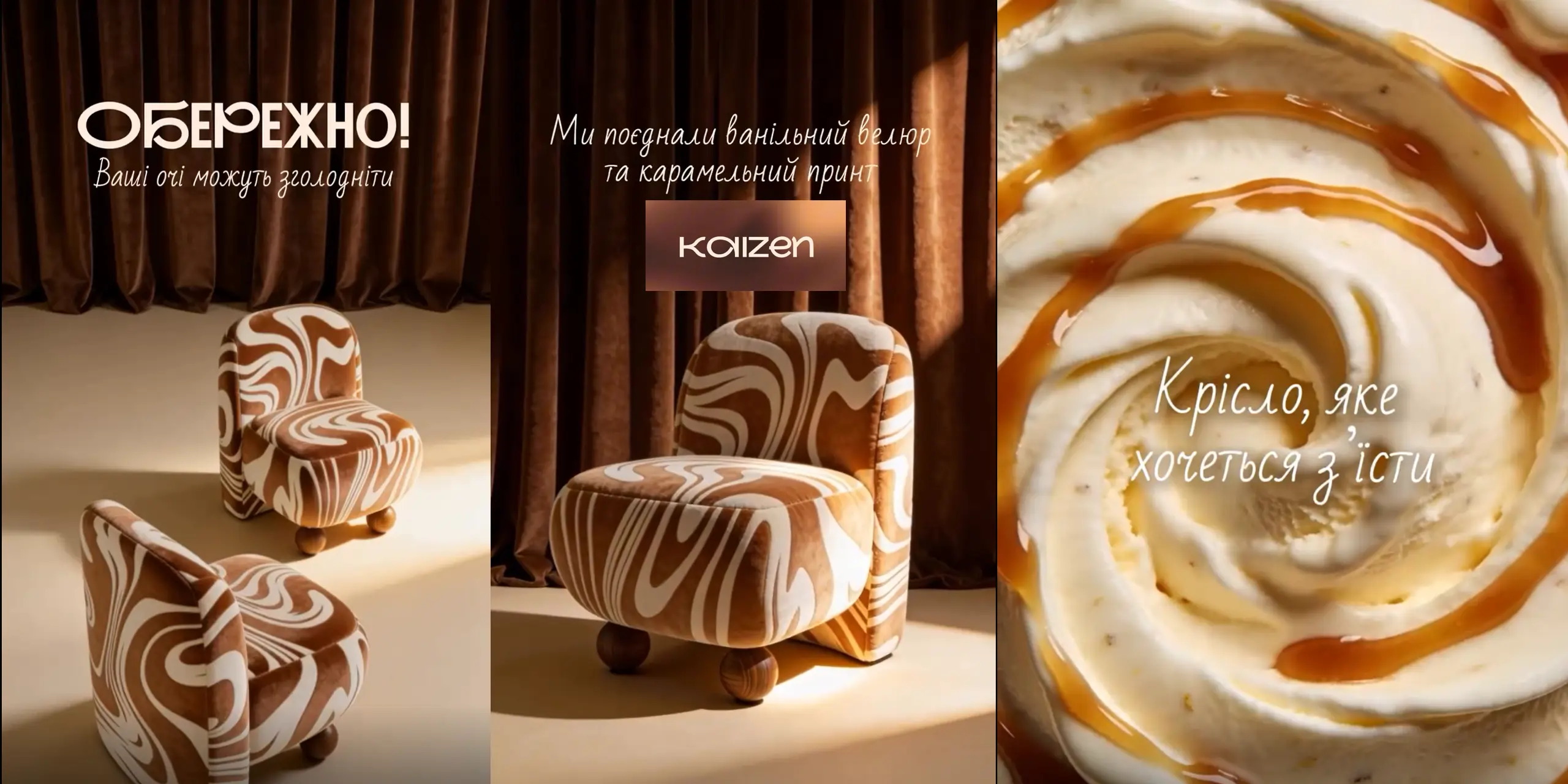
The light falls at an angle and touches the soft waves of the fabric. They seem to move – slowly, like caramel spreading over a warm surface. The gaze clings to these lines, the hand already knows where to reach, although it has not yet moved. There is a moment – brief, almost imperceptible – when you decide: just look or allow yourself more. And in this choice there is already a movement forward.
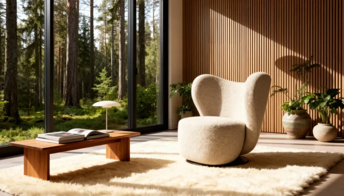
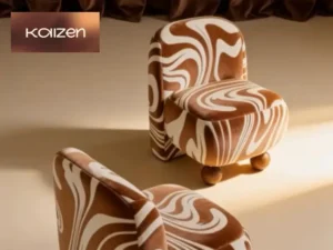
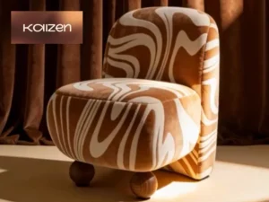
Shape: Why the Oasis Chair Looks “Tasty”
There are no random lines in this product. The Oasis armchair is built on the principle of soft geometry: rounded volumes without sharp transitions, a smooth back that seems to envelop.
This is not a classic chair with sharp corners. This is a form that works on feeling:
reduced visual weight;
“flowing” lines downwards;
the effect of integrity without division into elements.
That is why it is perceived not as an object, but as an object of desire.
Comfort as a design, not an accident
Comfort is not “added” here — it is built into the proportions.
📐 Dimensions:
width — 630 mm
depth — 670 mm
height — 780 mm
These settings create a balance between compactness and immersion.
Comfort formula:
COMFORT = DEPTH × BACK ANGLE × MATERIAL SOFTNESS
What this means in practice:
sufficient depth to sit down, not “land”;
backrest angle – to avoid straining your back;
softness – so that the body does not feel hard boundaries.
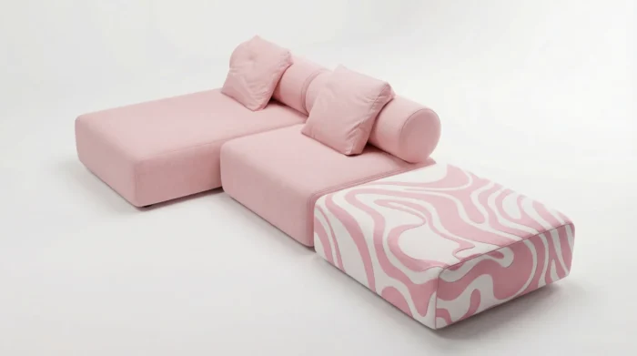
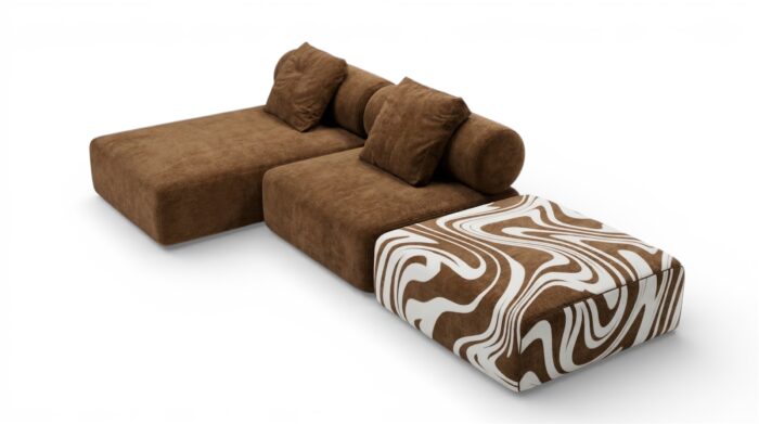
Materials: tactile experience as part of design
In the post, it sounds like “taste” — and that’s the exact wording.
The Oasis chair offers several texture options:
velour – smooth, almost “creamy”;
boucle – cozy, grainy;
chenille – deep and soft;
The mat is structural and stable.
It’s not just a choice of fabric—it’s a choice of a feeling that will be repeated every day.
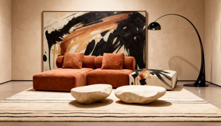
An accent chair that shapes the atmosphere of the interior
Print as identity
The wavy caramel pattern is not a decoration. It is the main accent.
There are 10 art print options available within the concept. And here a simple rule works:
the form creates the foundation;
the material gives a feeling;
Print shapes character.
Print selection table:
| Interior type | Recommended print style |
|---|---|
| Minimalism | calm, blurred lines |
| HoReCa / cafe | contrasting, bright waves |
| Home interior | warm, “caramel” shades |
| Studio space | graphic, clear shapes |
Usage scenarios: where the chair works best
The Oasis chair is not a universal “for everything.” It works where emotion is needed.
Main scenarios:
The recreation area at home is an accent and a place “for yourself.”
Coffee shops and restaurants are an eye-catching element.
Studios and showrooms are for creating an atmosphere.
Reception areas — to create a first impression.
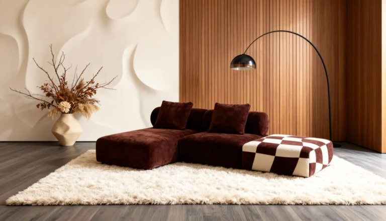
Balance between geometry and softness in every detail
Typical mistakes when choosing
Even a strong design can be “broken.”
Error → solution:
too bright interior → choose a calm print
small space → leave the chair as the only accent
cold lighting → add warm light
Bullet list: what not to do
place next to overloaded decor;
mix with aggressive colors;
to use as a “background” object.
The KAIZEN Approach: Why It’s More Than Just a Chair
This product was created not as a single model, but as the result of an approach:
minimalism + comfort;
customization for the client;
collaboration with designers;
continuous improvement (kaizen).
“Quality is not an act, it is a habit.”
This means: every detail here has been checked more than once.
Instagram context and story continuation
The idea of a “chair you want to eat” is not just a metaphor. It’s a way of conveying the main point: design can evoke a physical response.
In the post itself, this idea unfolds through the senses of taste and texture, and it is there that you can see how it looks in a living space: A chair that makes you want to eat😋
This is a logical continuation — from image to real perception.
How to choose your option
The choice is not limited to “like/dislike.”
Numbered list:
Determine the role of the chair in the interior.
Select a base texture.
Choose a print to match the atmosphere.
Check the lighting of the space.
Coordinate with other elements.
Final
The light slides across the surface again, and these waves are no longer just a pattern—they are a signal. That very moment when looking is no longer enough.
The Oasis chair is not made for compromise. It is made for choice.
The continuation of this story is where it already “lives” in the frame. And then — a logical step. Write in Direct#atfp_close_translate_span# the word “PRINT” and get all the options to find your own “taste”.